


Oasis
A-OAS

White
S-WHT

Marine
FBU04MARI
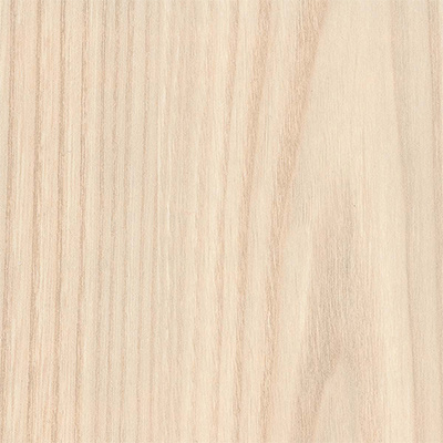
Light Oak
S-NTO

Navy
A-NVY
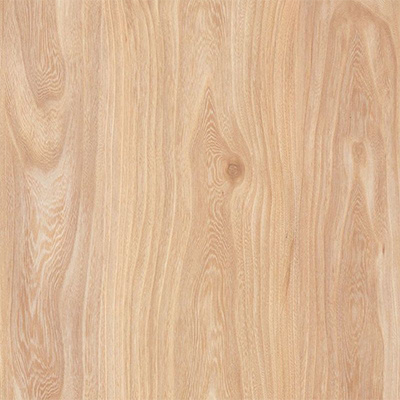
Natural Oak
S-NTO
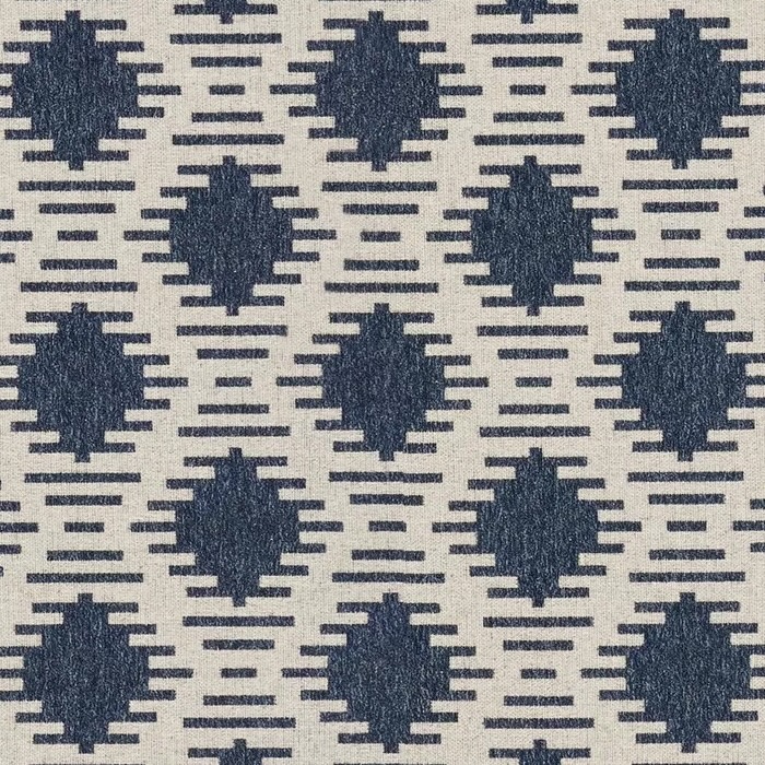
Denim
FHA33DENI

Saltwater
PP-SLT

Grey
S-GRY